If you're looking for a clear Notion guide that can be applied to mobile users, you've found the right corner of the internet!
But first things first! Make sure you review our original Notion guide for overwhelmed beginners before jumping into the mobile guide — especially if you're a Notion newbie! There, you'll find more detailed explanations for different features, which will improve your overall understanding and confidence using the app.
As with the first guide, I've formatted this in an ADHD-friendly way. (But both are helpful for all brains, not just the neurodiverse ones!)
Disclaimer: I have an android, so the user interface may be different on iOS devices. I'm not a phone aficionado, so that's all I can say about that! For reference, I have a Samsung Galaxy S22 Ultra and live in the United States. Note: we do not earn any commission from any clicked links!
Shortcuts and commands
Above your phone's keyboard, there should be a toolbar. You can scroll through it by swiping left.
Mobile toolbar items (from left to right)
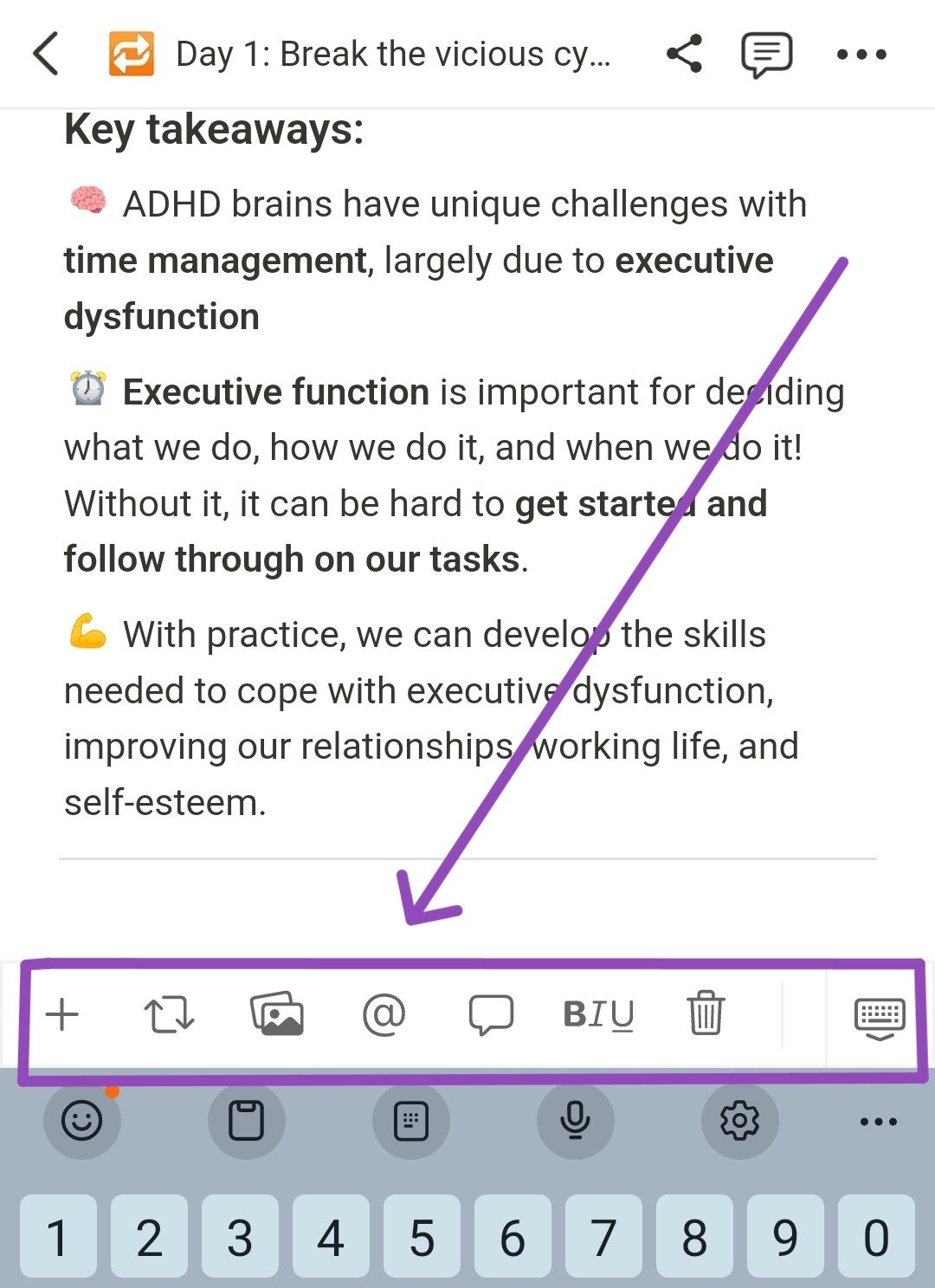
- Add element; add block (+)
- Turn [current block] into… (🔁)
- Add image
- Tagging [people or pages] (@)
- Comment
- Format text [entire block] (bold, italic, underline, strikeout, color, hyperlink)
- Delete [entire block]
- Undo and redo
- Change color [of text or highlight]
- Menu of more actions, such as 'move to…' and 'duplicate' (…)
Desktop vs. mobile
Some actions for Notion's desktop version are the same on mobile! But others are slightly different.
What's the same?
Follow the directions provided in the original guide to get the same results on mobile for these four shortcuts:
- Dividers ( --- )
- Tagging ( @ )
- Auto bullet list ( - , followed by space)
- Auto-numbered list ( 1. , followed by space)
What's different?
Adding a new element (or block)
The forward slash (/) is a desktop shortcut for adding new elements. This is not the case for mobile users.
Instead, tap the plus (+) symbol on your phone's keyboard, and begin typing the element you'd like to add — heading, database, a new page, toggle list, etc.
Suggestions and matches will pop up as you type. Tap the correct one when you see it to add it to your page.
Adding emojis
On the desktop version, users can add an emoji by typing a colon ( : ) followed by the name or description of an emoji. This does not work on mobile.
Instead, you can just use your phone's emoji keyboard.
Pros and cons of using Notion on a mobile device
Cons
1. The app still has deletion bugs that need to be worked out.
I've had entire lines of text and blocks disappear. I've also had random characters disappear from random words, causing all sorts of autocorrect confusion.
💡 Pro tip! If you see a swirling circle at the top of your page on your phone, that means it's auto-saving. I've noticed a correlation between auto-saves and data deletions. So pause for a moment while it saves to avoid accidental deletions.
2. You don't see the "big picture" when viewing databases.
For example, the desktop version has a "side peek" option when you open a database page, allowing you to see the page's contents while still viewing the entire database. This isn't a function on mobile.
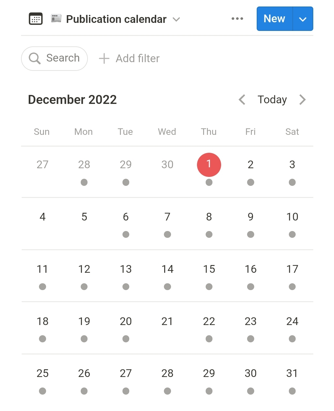
The mobile version also limits the amount of information you can see on your database views. For example, calendar events only appear as dots on mobile.
Pros
1. You can access and edit your work anywhere.
On the go? No problem.
Can't sleep at 3am but not in the mood to get up and go to your computer? Also no problem.
2. You can't see when other people view the page you're on.
This is an anxiety that I'm sure others with ADHD can relate to! Like Google sheets, Figma, and Miro, Notion is a collaborative platform. While this is great for team productivity, it can also be intimidating — "Are they watching me type? Are they judging my typos? Why am I making so many mistakes all of a sudden!?"
While viewing or editing a Notion page on mobile, people can still view it simultaneously. However, you won't be able to see their active bubble at the top of the page, nor their unnerving cursor as they scroll and click around on the page.
Other tips for mobile Notion users
Everything is still a block!
Like the desktop version, everything on mobile is a moveable block.
How to move Notion blocks on your phone:
- If your phone's keyboard is open, tap the back button if you have one. Alternatively, tap the keyboard down icon on the toolbar above your keyboard.
- Hold your finger firmly on the block you want to move until you feel a slight vibration* (*only applies if you have haptic feedback turned on). The block will also appear to separate itself from the page. Both instances indicate that it's ready to move.
- Drag your finger to carry the block. A blue line will appear (above or below other items) where the block is set to land, but it won't land until you let go.
Play around with Notion widgets!
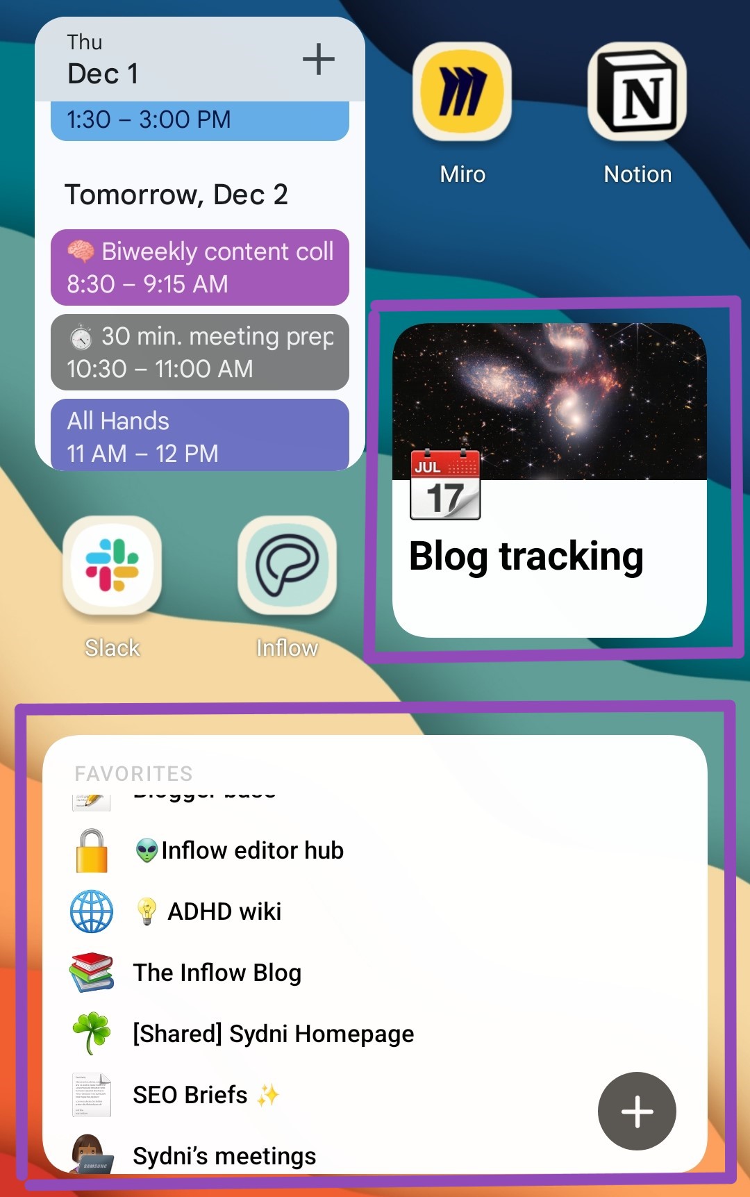
I can't speak on iPhone features due to a lack of personal experience, but most androids have widgets. Widgets are basically mini versions of an app — not all apps have widgets, and some widgets are more interactive than others. But nonetheless, widgets are incredibly handy for my ADHD brain.
Currently, there are three Notion widgets available for android users. You can see two of them in the above image.
Skip the mobile version if you're just getting started.
Because of the nuances of the Notion app on mobile devices and tablets, it's more challenging to get used to if you're using a phone. The best way to learn how to use Notion is by fully experiencing the desktop version.
It's hard to navigate the mobile app already. Add that to your novice Notion user status, and you'll probably just end up frustrated.
Once you've given yourself time to understand Notion off your phone, you'll be ready to use Notion anywhere.
--
If you have more questions about Notion, or if you would like to request more content on how we can help people with ADHD get the most out of technology tools, send me an email! - sydni@getinflow.io


